How to become a better artist (and make the world a happier place)
*Any links to supplies found on Amazon are affiliate links. Should you decide to bring home an art tool I’m talking about and purchase it through the links found here, a few pennies of that purchase are distributed to me. It isn’t much, but it (slowly) adds up—it’s a lovely way to support the content that I create, and it comes at no cost to you, which is awesome, too. Thanks, in advance, to anyone who supports my art in this way; I really appreciate it!
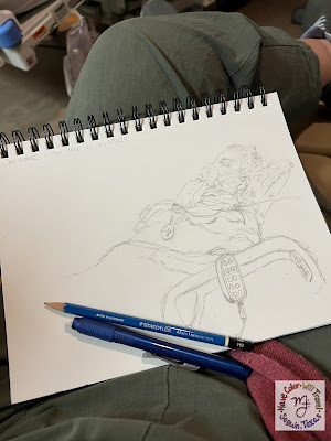
This month I did something I've never done before: I completely colored the exact same illustration FOUR times! I have NEVER been this colorfully productive in such a short period of time, ever. Truth be told, I have far more "in progress" coloring pages in the studio than I do completed bits of coloring art, a fact that I bet quite a few other coloring enthusiasts recognize (the brand new coloring experience is always more alluring than the partially finished one). I'm rather shocked that I finished this many coloring adventures back to back to back to back, which is why I've been pondering this question: what exactly did I do differently to yield these plentiful results (yes, I know I'm a nerd🤓)? |
| This beautiful "ROYGBIV with a twist" palette was suggested to me by Nicole Denny Zorn. It consists of Crimson Vermilion, Goldenrod, Pine Green, Navy Blue, Violet and Lavender. The grey in the circles was my idea, and I'm not sure it was my best choice, however, I love this colorable card's deeply saturated look nonetheless! |
 |
| The moment I read Stephanie Rault's suggestion of a silver and blue palette for this Free Page I knew I wanted to used a watercolor wash of indigo as the base. I had a spare Colorable Card of this illustration lying around (when a card collection first comes to print, I have MANY trial & error runs through the printer, and I save them all to play with later) so this one is on 90lb hot press Fabriano watercolor paper. A watercolor wash on printer paper would not have turned out as lovely as this one did as that paper is NOT designed to accept moisture. |
 |
| Stephanie Rault also suggested to me a fully pink palette for this month's Free Page. I knew this palette would be tough (I've never been one to "think pink"), so I explored her suggestion on Procreate and created my my ever first digitally colored page. To learn how to color my free pages with Procreate, visit this post--it's really and truly fun to color with pixels! |
 |
| To make the most out of the lovely "Go Purple!" suggestion I received from Alex Longoria I went though ALL of my colored pencils and pulled out everything I felt could pass the Donny Osmond test (as a kid I loved his purple socks). Before applying the colored pencil though I laid down a haphazard purple highlighter marker wash (I printed this Free Page on 110lb cardstock). The streaky wash helped create a rich visual texture and added to the colored pencils' saturation level. This is an art technique I use all the time, and it always yields stunning results! |
My answers weren't "rocket science," as they say, but I'm sharing them here with the hope that there might be some useful nuggets in my musings that will help someone else rev up their creativity mojo to follow through on some of their colorful intentions.
Answer #1: I was coloring for someone else.
Typically when I set down to color I do so for the following reasons: to create colored examples for my online art tutorials, to create colored examples of items in the HCWT Coloring Shop, to create colored examples to use in my workshops, to create colored examples for my blog posts about my Free Pages. "Creating colored examples" is pretty much ALL the coloring I do these days (not a complaint, just a side effect of being an independent illustrator of coloring books & adventures), and I can't remember the last time I colored "just because." Pictures of these four cards also ended up in a blog post (this one), BUT my intention for coloring them was wholly different. I colored these four lovelies with the intention of sending them off to friends and family. Typically when folks I love have birthdays or are in particular need of cheering up I send them cards I make out of my watercolor doodles. But since I decided to give one of my card illustrations away for the February Free Page I thought I would give coloring up some birthday & cheering-up cards a try (hard to believe I've never done this before, but it's true).
Because I was coloring for someone else (I have quite a few February birthday babies in my life) I not-so-shockingly found ways to sneak in coloring time all over the place: while listening to a podcast my son wanted me to hear, while chatting with my partner as he cooked dinner, while relaxing on a rainy Saturday afternoon, while procrastinating things I didn't particularly want to do. There are any number of tasks and time wasters I might have done in place of coloring these four cards over this last month, but because these cards were for other people, I gravitated towards working on them whenever an opportunity to colorfully multitask arose.
Answer #2: I crowdsourced color palette ideas.
I've colored this particular illustration MANY times (the best way to advertise something as niche and unique as specialty coloring experiences is to show folks how different and fun it is to color on art papers), and I've explored every color palette and art supply my brain could think of, so when it came to this card I was bored with my own ideas. Which is why when I decided I was going to color this illustration for my February birthday cards this year I also decided to ask the internet for their color palette suggestions.
And, wow, did they provide! I thought I might get one or two folks interested in helping me out (When you poll the internet and REALLY and TRULY want their opinion, I find very few folks share their thoughts. Unlike unsolicited advice & opinions, which comes whether I ask for it or not.🙄), but I got FOUR really cool and totally-not-in-my-wheelhouse suggestions. Each one of them excited me and felt like a double-dog dare (and I never turn away from a creative challenge). So without thinking about whether or not I had time to color four different "Love is love" cards, I just went right back to the internet to declare "challenge accepted" to all four suggestions, which leads to my third and final answer to my creative productivity pondering.
Answer #3: I sought out accountability.
I'm convinced that there isn't a goal/intention out there, creative or otherwise, that is achieved without the help of accountability. Whether it's your friends, family, or co-workers, folks you know IRL (in real life) or exclusively on the internet, sharing your intention with the supportive (that bit's key) humans in your life is the one sure-fire way to guarantee you will exceed your own expectations.
It was fully in my head, I know, but once three lovely humans (Nicole Denny Zorn, Alex Longoria, and Stephanie Rault, aka @demigotte on Instagram) shared with me their color palette suggestions, I knew I had to follow through on all of them. I couldn't have any one of them thinking I liked a single person's suggestion over another's; I really didn't want any feelings getting hurt after they'd all been so generous with their ideas! Of course, each of these three creative souls has a very big and important life, so there was no way that my choosing to follow through or not follow through on their palette suggestions amounted to even the teeniest hill of beans. BUT, my feeling like it might and tagging them on my social media posts about my coloring progress created an infinity loop of awesome (they were awesome for sharing their ideas with me, and I was awesome for sharing with them how I translated those ideas) that resulted in an enormous amount of finished coloring art from me in a short amount of time.
Of course, ALL these birthday greeting and Valentine's Day pick-me-up cards are going to be late regardless of those creativity boosters I just mentioned--I said I finished coloring these cards quickly for me NOT that I colored them all on time! When it comes to happy mail, however, I am quite a firm believer in the adage "better late than never" (I know I've never been anything but delighted to see my name handwritten on an envelope I've pulled from my mailbox), so I'm not worried about that too much.
I'm also not worried about what will become of all this coloring art once it gets popped in the mail. Yes, I spent quite a few hours on each card (even the digital one); yes, I am really proud of how each one turned out; and yes, I think each one is worth keeping and displaying (all coloring art is). BUT, once these cards get popped into the mail they no longer belong to me and what happens to them is none of my business. Does that mean these four coloring experiences aren't precious to me? Absolutely not! I learned from coloring these cards, connected creatively with friends by talking about how to color these cards, and enjoyed many colorful hours making these cards beautiful. But just because they are precious to me doesn't me that I shouldn't let them go. In fact, after years of coloring and making cards for others I've discovered that it is because they are precious to me that I should let them go. Holding on tight to my art, coloring or otherwise, will never make me a better, happier artist nor will it make the world a better, happier place. However, when I choose to make art for someone else and give it away I am 100% certain that that is exactly what I'm doing: becoming a better artist and making the world a better place.

Comments
Post a Comment